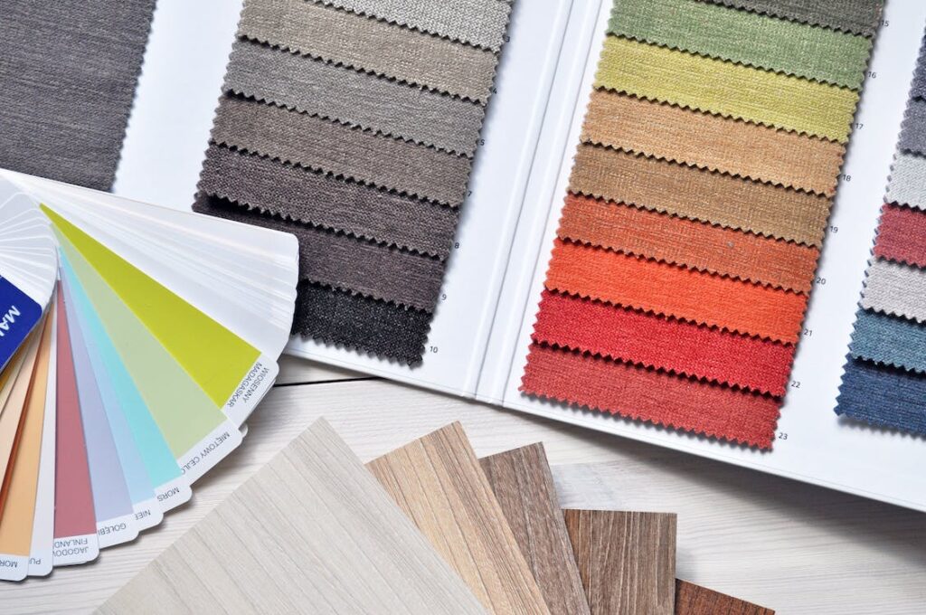
Choosing the right colours for your office can have a significant impact on the atmosphere and productivity of your workspace. While it may seem like a small detail, the colours you choose can affect everything from your employees’ moods to their ability to concentrate and focus. But with so many different options to choose from, if you’re unsure where to begin, don’t worry— you’re not alone!

In this article, we’ll explore the importance of colour psychology in the workplace and provide tips on how to choose the right colours for your office, taking into account your brand identity, company culture, and the specific needs of your employees. For personalised advice, contact our team at HQ Renovations today.
Why Colours In The Office Matter
Colours in the office are more important than you may think! This is because they have the power to influence our moods, emotions, and behaviour. Remember when you were in your early school years and everything was colourful? There was a reason for that! Colour psychology affects us at all ages, even now as adults in the workplace.
Different colours have been shown to have different psychological effects on individuals, which can impact everything from their creativity and productivity to their ability to concentrate and focus. For example, blue is often associated with calmness and productivity, making it a good choice for workspaces where concentration and focus are important. On the other hand, red is associated with passion and intensity, which can be great for creative spaces or work environments where energy and excitement are needed.
By understanding the psychology of colour, businesses can choose colours that align with their brand identity and company culture, while also creating a workspace that supports the needs of their employees.
Is colour psychology not in your wheelhouse? Not a worry— for some of us, it’s a way of life. Working with an interior designer is a great way to ensure you get the colour scheme ‘just right’ for your space, so you can promote the outputs you want and minimise the ones you don’t.
Popular Office Colour Choices
Popular colour choices tend to fall into two main categories: neutral colours and bold accent colours.
Neutral colours, such as white, grey, and beige, are popular because they create a clean and professional look that can easily be incorporated into any design scheme. Whether you work as an editor or engineer, neutral tones lend themselves well to any office regardless of the type of work that goes on there. Additionally, neutral colours can help create a calm and focused atmosphere, which can be especially important in workspaces where concentration is key.
Bold accent colours, such as red, blue, and green, are also popular choices because they can help inject energy and creativity into the space. These colours are often used as accents in areas such as feature walls, furniture, or decorative elements, adding visual interest and personality to the workspace.
Ultimately, the right colour choice for your office will depend on your brand identity, company culture, and the specific needs of your employees.
How To Plan For Colour In Your Office Renovation
After considering your brand identity and company culture, it’s time to dive deeper into the details. What colours are already associated with your brand? Do you have any existing style or design guidelines that need to be followed?
Next, consider the needs of your employees. What types of tasks do they perform? Are there any specific colours that may help improve productivity or mood? Once you have a clear understanding of these factors, you can begin selecting colours for your space.
Consider using a neutral colour palette for the walls and larger design elements, such as flooring and furniture, to create a professional and clean look. Then, incorporate bold accent colours through smaller design elements, such as artwork, decorative accessories, or accent walls, to add visual interest and personality to the space.
Remember, when planning for colour in an office renovation, it’s important to balance functionality with aesthetics to create a workspace that is both visually appealing and conducive to productivity.
Mistakes To Avoid When Choosing Colours For Your Office
When choosing colours for an office renovation, there are several mistakes to avoid to ensure that you create a space that is both functional and visually appealing.
One common mistake is choosing colours based solely on personal preference, rather than considering the needs of the business and its employees. While blue may be your favourite colour, it may not be the best choice for your office and should be left within your walls at home! It’s important to select colours that align with your brand identity, company culture, and the specific needs of your employees.
Another mistake to avoid is using too many bold or bright colours, which can be overwhelming and distracting in a workspace. Instead, consider using bold colours as accents or in small doses to add visual interest without overwhelming the space.
Finally, it’s important to consider the lighting in the space when choosing colours. Different types of lighting can affect the appearance of colours, so it’s important to test colours in the space and under different lighting conditions before making a final decision. By avoiding these common mistakes, businesses can create a workspace that is both functional and visually appealing, promoting productivity and employee satisfaction.

